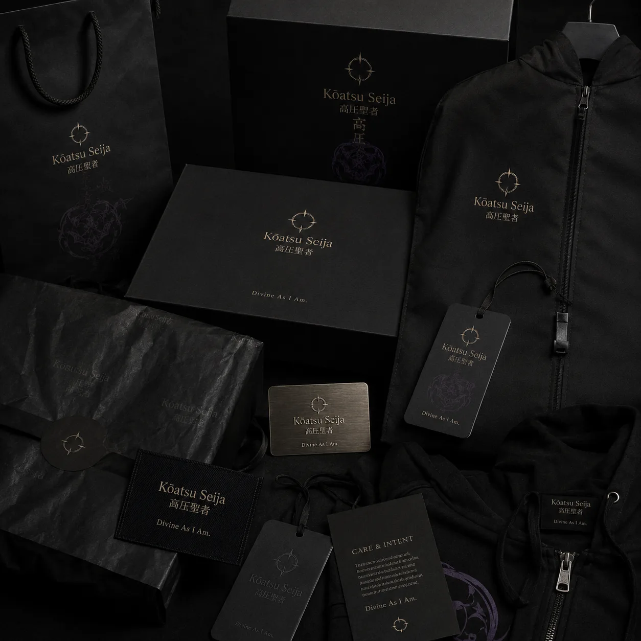
A hoodie can be ordinary, or it can become the piece a person reaches for when they need to feel composed. That difference comes from more than a graphic. It comes from weight, structure, fit, finish, and meaning.
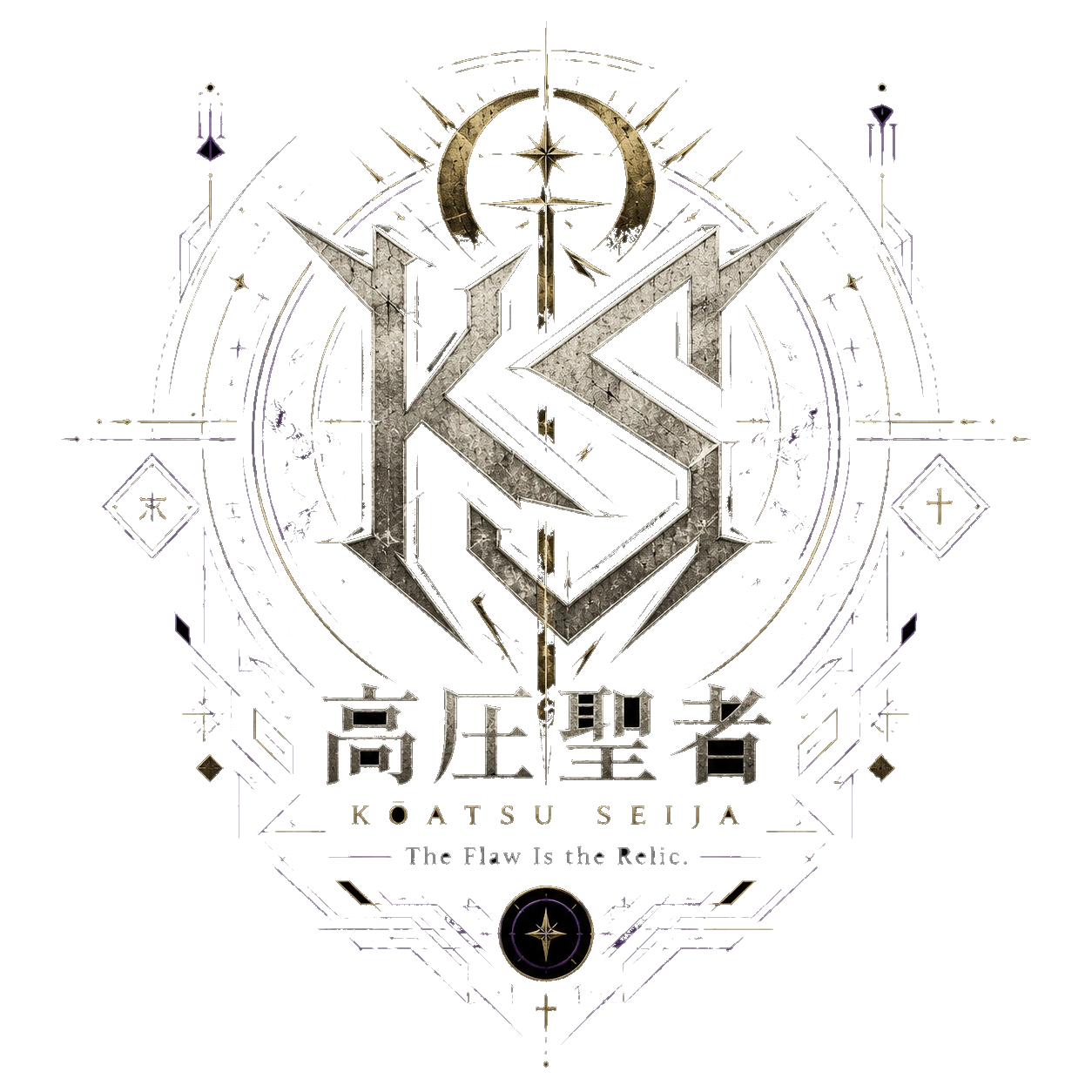
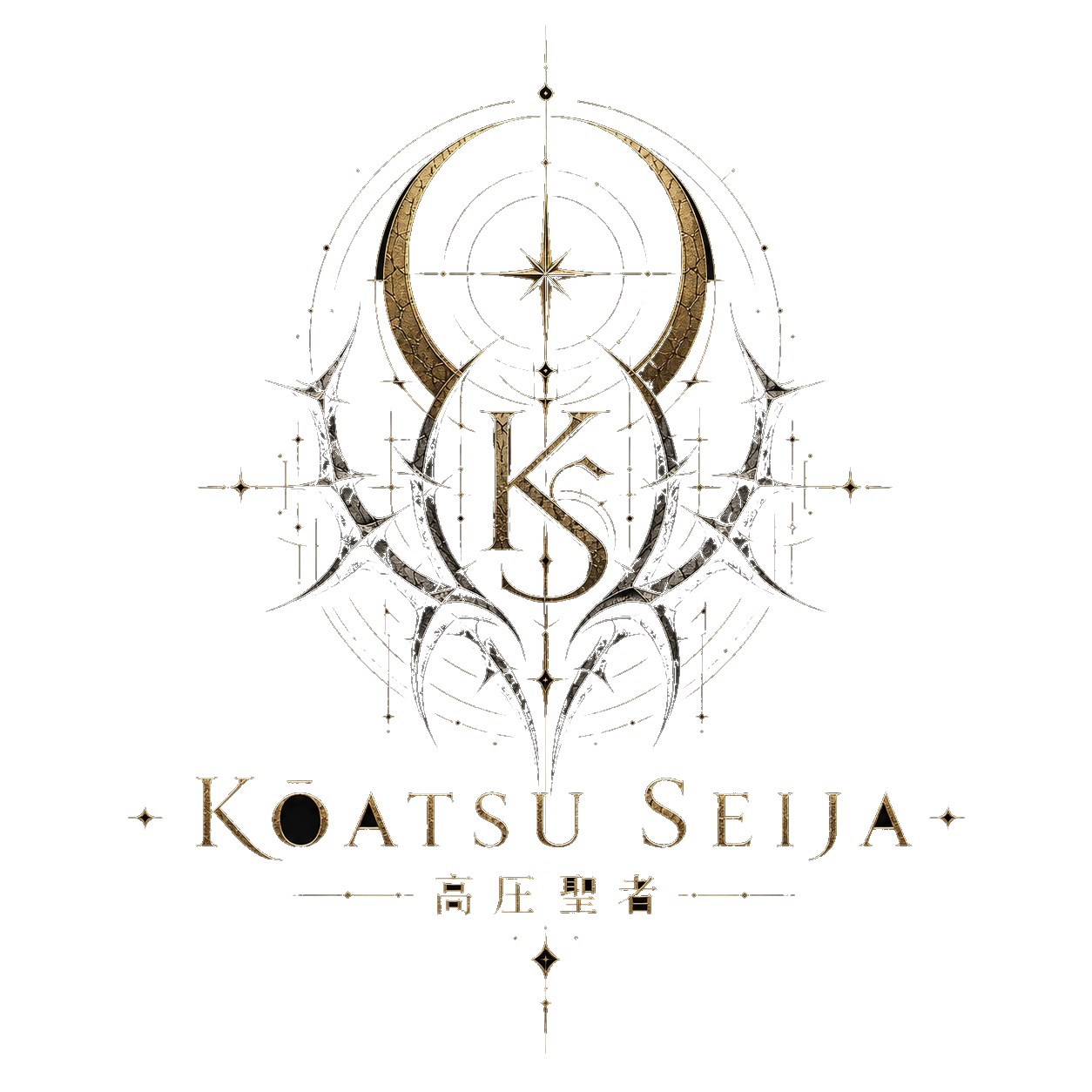
For Kōatsu Seija, the hoodie is not just a casual item. It is one of the clearest expressions of the brand’s idea: pressure awakened me. A good hoodie should feel protective without feeling stiff, dark without feeling empty, and comfortable without feeling careless.
Weight Changes Everything
The first thing people notice in a premium hoodie is weight. A thin hoodie can still be useful, but it usually does not carry the same presence. Heavyweight fleece or dense cotton blends create a stronger silhouette. The garment hangs better, frames the body better, and photographs better.
Weight also changes how the wearer feels. A substantial hoodie can feel grounding. It gives the body a sense of coverage and protection.
Structure Creates Presence
A premium hoodie should not collapse around the shoulders. The hood should have shape. The cuffs should hold. The waistband should sit cleanly. The body should have enough room for movement without looking accidental.
Oversized streetwear depends on structure. Without structure, oversized becomes sloppy. With structure, oversized becomes intentional.
Print Quality Is Part of the Value
A hoodie graphic should feel integrated into the garment. The print should not look like a temporary sticker. It should survive wear, movement, photography, and repeated styling.
Kōatsu Seija graphics carry words and symbols with weight: 高圧聖者, KŌATSU SEIJA, Pressure Awakened Me, The Flaw Is the Relic, Not Perfect. Deity. Those lines need clean execution.