
A streetwear graphic is not just artwork. It is architecture. Where the design sits on the garment changes how the body reads, how the outfit photographs, and how the brand feels when someone walks into a room.
Premium streetwear does not rely only on a cool symbol or a strong phrase. It relies on placement, scale, spacing, balance, and restraint. A design can be powerful and still fail if it is placed without discipline.
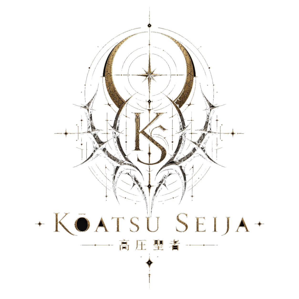
Kōatsu Seija is built around strong language and heavy symbols: KŌATSU SEIJA, 高圧聖者, Pressure Awakened Me, Divine As I Am, The Flaw Is the Relic, The Damage Is Divine. Those lines carry weight. The job of graphic placement is to let that weight land correctly.
The Chest Print: Direct and Immediate
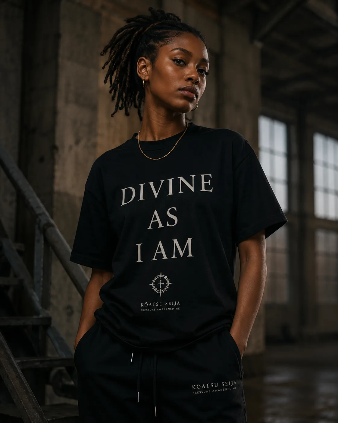
A chest print is the fastest message. It faces the world first. That makes it ideal for the brand name, a clean mark, or one short statement.
A chest design should be readable from a normal distance. If the typography is too small, the garment loses presence. If it is too large, the shirt can look cheap or crowded. The strongest chest prints usually sit around the upper center of the garment, with enough negative space around them to feel intentional.
The Back Print: Story and Impact
The back print is where a brand can tell a deeper story. It gives space for a larger emblem, a phrase, a scene, or a more detailed sigil. It also creates drama when the wearer turns away.
For Kōatsu Seija, the back is the right place for halo-thorn crests, circular sigils, and longer lines like “Divine As I Am. The Flaw Is the Relic.” The back print can carry the mythology while the front stays cleaner.
Scale Is the Difference Between Luxury and Noise
Streetwear graphics can be large, but they still need scale discipline. Oversized does not mean uncontrolled. A huge back print can work when the surrounding garment is clean. A small chest mark can feel powerful when the fabric, fit, and spacing are strong.
Luxury is often about deciding what not to add. Kōatsu Seija can be dark and symbolic without covering every inch of fabric. The blank space is part of the design. It gives the symbol room to breathe.